
Muted Colour Mastery
12 Paint Shades That Make a Big Impact in 2025
Why Muted Colours Pack a Punch
Muted tones are 2025’s quiet power players. Understated but rich, they allow architectural lines, natural light, and layered textures to take the lead.
Here’s why they work:
Timeless feel – their softness lends long-lasting elegance.
Textural contrast – great with wood, linen, stone, or metal.
Mood-enhancing – low-chroma palettes soothe the senses.
Quick Tips for Using Muted Colour Tones
Always sample in natural light – muted tones are highly reactive to light shifts.
Balance undertones – earthy pinks love soft black, green-greys suit warm brass.
Accent with texture – woodgrain, boucle, velvet and rattan elevate soft hues.
12 Impactful Muted Paint Shades for 2025

1. Joanna (322) – Little Greene
A soft green-grey with vintage roots. It feels timeless and comforting in bedrooms or hallways.
Style Tip: Works beautifully with natural oak, linen, and antique brass.

2. Slaked Lime – Little Greene
A soft, architectural off-white with subtle grey undertones. Perfect as a whole-house neutral backdrop.

3. Travertine Light – Little Green
A chalky, pale neutral beige inspired by soft limestone. Gorgeous in calm, modern living spaces.

4. Pigeon No. 25 – Farrow & Ball
Iconic dusty blue-green that works wonders in kitchens or bedrooms. One of the most versatile muted tones around.

5. Douter – Farrow & Ball (New for 2025)
A smoky grey-green inspired by old pewter and candle snuffers. Sublime on joinery and panelled walls.

6. Sap Green – Farrow & Ball
Reintroduced from the archive, this olive green is deep and grounding without overpowering a space.

7. Broccoli Brown – Farrow & Ball
A moody, neutral brown with softness and depth. Adds richness without stark contrast.

8. Cinnamon Slate (2113-40) – Benjamin Moore
The 2025 Colour of the Year: a dusky, warm plum-brown that oozes quiet glamour.

9. Sea Salt (CSP-95) – Benjamin Moore
Soft, mineral aqua with a barely-there beachiness. Brings
freshness to bathrooms and sunrooms.

10. Ashwood Moss (1484) – Benjamin Moore
Silvery olive-green that feels sophisticated and heritage-rich. Try it on woodwork or dining rooms.

11. Tissue Pink (1163) – Benjamin Moore
A beautiful, earthy blush-pink that flatters and calms. Gorgeous in bedrooms and intimate spaces.

12. Tuscan Red – Little Greene
An earthy, muted terracotta red that adds a grounded, Mediterranean depth. Beautiful with creamy whites and linen upholstery.
Styling Cheat Sheet
Shade name Best rooms What to pair it with Joanna White Hallways, Kitchens Pale oak, sisal, bronze fittings

Image credit Neptune
Pigeon Kitchens, studies, w.c Brass, black accents, marble

Image credit Alexander James
Cinnamon Slate Dining, reading rooms Dark wood, velvet, aged gold
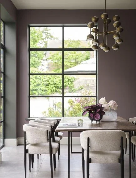
Image credit Benjamin Moore
Final Thoughts
Muted colour tones offer gentle drama and design depth without overwhelming a space. From chalky greens to powdery neutrals and dusky plums, this year’s palette proves that quiet shades can still make a big statement